In this lesson, we are going to see the grid classes used in all the Bootstrap versions.
Bootstrap Grid Classes
The Bootstrap grid system allows 12 columns across a row. I Hope, you have an idea about the bootstrap grid system, if not please do have a look at Bootstrap Lessons: Lesson 2 - Bootstrap Grid System before proceeding further with this lesson.
Generally, Bootstrap has 5 grid classes. They are:
- col-xs-*
- col-sm-*
- col-md-*
- col-lg-*
- col-xl-*
xs represents extra small devices (mobile phones), sm represents small devices like tablets, windows surface (Portrait mode), etc, md represents medium screens like normal desktops, and lg is for larger desktops. The * is to be replaced by the number of columns that we want an element to occupy within a row.
Let us see examples for each of these classes. We will start with the reverse order of the bootstrap classes mentioned above.
col-xl-*
This is for extra-large screen devices with the viewport width greater than or equal to 1200px.
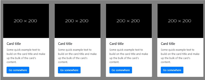
Suppose, we need the below layout for the extra-large screens:

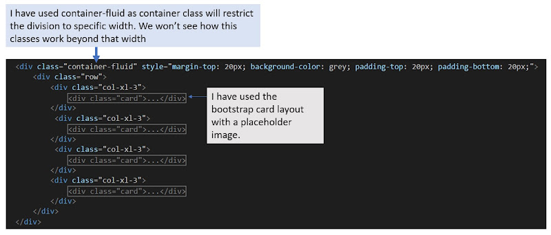
Example layout This layout has 4 boxes in a row so each box would be of 12/4 = 3 columns. So, the HTML code for this will be as below:-

HTML Code for the example layout I would recommend you to use the previous example project for this. If you don't have the previous example, please create it from here: Bootstrap Lessons: Lesson 1 - Bootstrap & its Integration. I have created a new webform for this in the same project.
The output will be something like below for this code:

Output screen with the browser's web inspector The output for the screen smaller than 1200px will be like below image:

col-xl-* output for screens below 1200px col-lg-*
This is for the large desktop with the viewport width greater than or equal to 992px.
Now, consider we want the below layout on large desktop view:

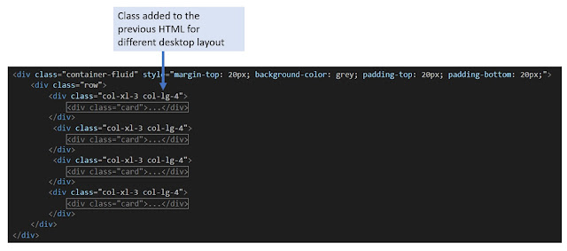
A layout that we want on the desktop screen Here, there are 3 boxes in a row. For that, the only thing we have to add in the previous code is to add col-lg-4 (12/3 = 4) class to the divisions. As the bootstrap row allows only 12 rows to line up in a row, the fourth box will automatically shift to the next line. So, the changed code will be:

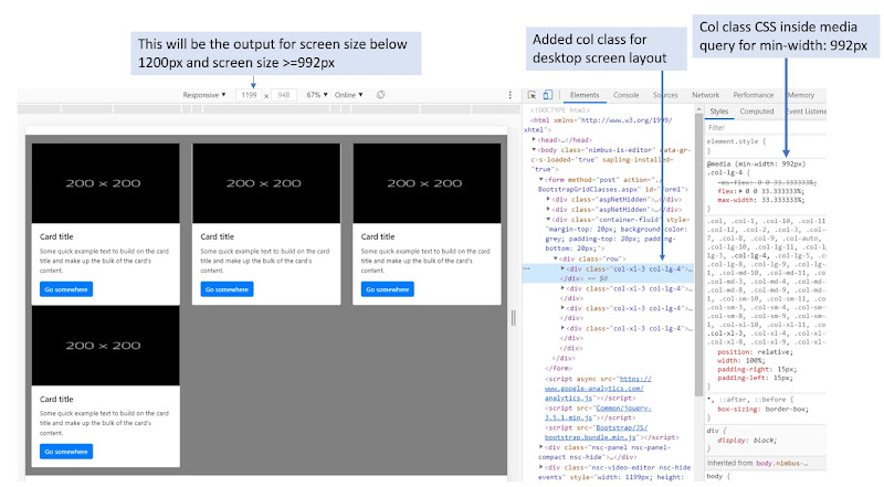
HTML code for the layout we need on the desktop Check the output for different devices with the web inspector. We will get the below output for screens greater than or equals to 992px and less than 1200px

Output on a browser with the web inspector If you want to have the same layout for the extra-large screens too, you have to remove the col-xl-* class from the HTML. Remove the class and see how it works
col-md-*
This is for medium screen size desktop screens with the viewport width greater than or equal to 768px.
Now, consider we need the below layout for the medium desktop screen:

Output layout for medium screen desktop
To achieve this layout again on medium screen devices, all we need to do is to add col-md-3 (12/4 = 3) to the HTML code that we have. Check the output after adding this class as we did for previous classes.col-sm-*
This is for small-screen devices like tablets, iPad, etc. with the viewport size greater than or equals to 576px
Suppose, we want the below layout for tablet screens:

A layout that we want on small screen devices For this, the class we need to add in the existing code is col-sm-6 (12/2 = 6) as there are 2 boxes in a row.
col-xs-*
This is for the mobile devices with the viewport size less than 576px
Suppose, for the mobile devices, we want the below layout:
 |
| Layout for the mobile devices |
For this, the class that we need to add to the existing code is col-xs-12 (12/1 = 1)
This is how the bootstrap classes work generally. Bootstrap 4 has introduced a class col-* that is similar to col-xs-*. This is the only added class in the bootstrap 4 grid system. If you want to explore more about the Bootstrap 4 grid classes, refer to the official documentation from getbootstrap.com.
For any queries and feedback, you can reach me at [email protected].To get the full example, be a Patreon today.
