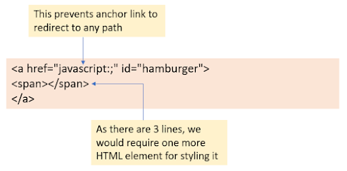
Most of the web developers struggle while making a responsive navigation or menu bar compatible with all the screen sizes and browsers. This lesson is about developing responsive navigation with simple HTML, CSS, and jQuery coding.
Steps to develop this navigation
- Make sure of the fact that you are aware of media queries and how to write them. If not, please refer to this: - CSS Media Queries before going further.
- Go through the previous lesson "Lesson 3: Part 1 - Designing Widgets: Main Navigation" if you have not gone through. It shows how to design desktop navigation
- Download the latest version of jquery from jquery.com
- Create a folder with any name that you want to, create 2 folders - CSS and JS inside that and place the downloaded jquery file inside the JS folder
- Now, open any text editor and create an HTML file inside the main folder and a CSS file inside the CSS folder, and a jQuery file inside the JS folder. The folder structure would look like this:
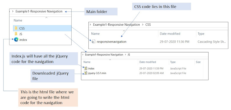
Folder Structure of the Project Note: To create html, css, and js file, open any of the text editors and save the text file with extensions .html, .css, and .js respectively as shown below:

Saving js file As shown in the image, replace .js with .css for saving css file and .html for saving HTML file.
Add references of the js and CSS file in your HTML file inside the head tag as below:

Meta tag and external file references Replace the URLs with yours in the script's src attribute and link's href attribute.
Now, copy the entire HTML and CSS code from Lesson 3: Part 1 - Designing Widgets: Main Navigation in the HTML & CSS file respectively. Save the files and check the output (Open the HTML file in any of the browsers). The output should be as below:
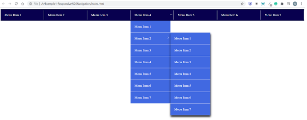
Output 1 - Desktop Navigation without any js Remove default margin, padding from the body and set box-sizing of the elements
Remove default margin and padding from the body tag which a browser sets for it by default and change the box-sizing in such a way so that the padding & border lies inside the content space. To do this, add below CSS in your CSS file at the top:

Setting box-sizing for all the elements and removing default padding, margin from the body tag If you are not aware of the box-sizing property, please refer to Important CSS properties.
Hamburger Icon for Mobile Menu
Before starting the desktop view, always look into the mobile design because it might have some more elements than the desktop view. In this example, we have a hamburger icon above the navigation as shown below:
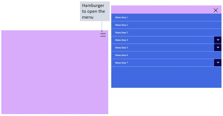
Mobile Menu Design So let us design this icon first. For that, we need to add an element before the navigation division. I have added an anchor tag as shown below:HTML code for the hamburger icon The CSS for the hamburger icon would be as below: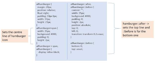
CSS coding for the hamburger menu - The next thing to do is add 3rd level navigation inside the 2nd menu item of the second level navigation so that the output would be like below:
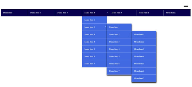
3rd level navigation I am not going to show the code for this 😁. If you are not able to do this, please go through Lesson 3: Part 1 - Designing Widgets: Main Navigation one more time.
- Now, let us design the mobile navigation. We do not need the desktop styling to be applied in the mobile view. Also, we do not want to display the hamburger menu icon on the desktop view. So, move the desktop styling code inside the media query and add display none property to the hamburger menu icon as shown below:

Media Query for the desktop view - Let us design mobile navigation now. The CSS would be:
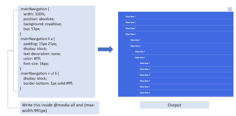
CSS code for mobile navigation Here, we need 2 things more. They are 1. The border-bottom needs to be extended end to end and 2. The arrow icon. To extend the bottom border we will use ::before and ::after pseudo-selectors as shown below:

CSS code for the mobile navigation For arrow, we have to write some jquery, which we will do after writing jquery for the desktop view navigation. Add the property overflow-x: hidden to the div main navigation as shown below:
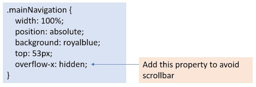
CSS property added to the main navigation division Move all the hamburger CSS inside the media query for mobile if it is placed outside anything, because we need it only in the mobile view.
Now, let us build the functionality of the navigation. We will start that from the desktop view. Initially, the inner level navigation should not be visible. It should be visible only when the mouse moves over its parent menu. For that we will hide all the inner level navigations, the CSS would be:

CSS to show hide inner navigation on mouse hover The only thing left to do now for desktop navigation is to write jQuery code to add and remove the active class from the parent li on mouse hover. So, open the js file that we have saved initially and write the below code:
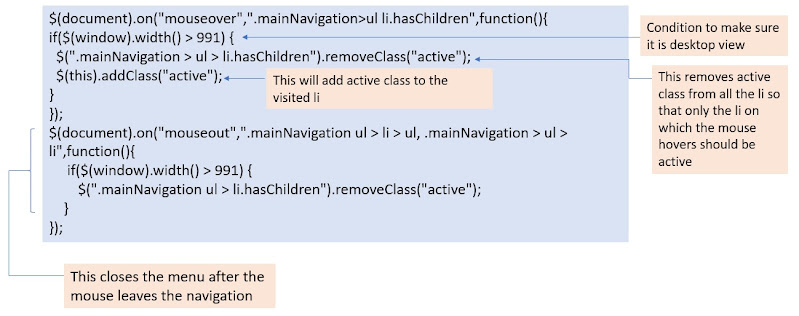
JQuery Code Snippet for the Desktop Navigation Now, save the js file and check the output, the desktop navigation is done now.
Let us make the functionality of mobile navigation now. The first thing to do is to add the arrow with the help of jquery as below:

jQuery to add the arrow This will make the arrow visible in the desktop view too. So, add below CSS inside the media query written for the desktop view:

CSS to hide arrow from the desktop view Let us design the arrow for the mobile menu. Write below CSS inside the media query for the mobile menu:
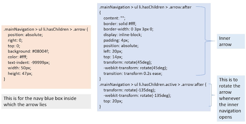
CSS Code for the Mobile Menu Arrow - Now, the jQuery for the mobile menu would be:
Save this to the js file and see the output. You can see the active class toggled on the click of the arrow from the web inspector as shown below: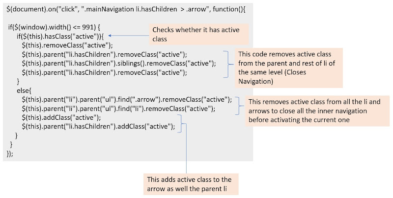
jQuery code for responsive navigation 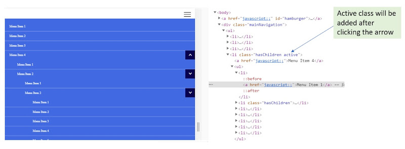
Verifying the js code through web inspector Now, all we need to do is to design the menu, CSS code to make it active on click would be:
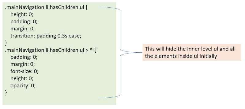
CSS to hide inner navigation initially Now you might notice that the arrow is somewhat shifted and there is a border that's appearing after the last li of inner level navigation as shown below:
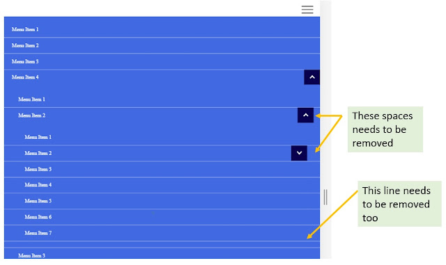
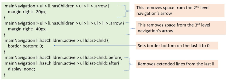
Spaces that need to be removed The CSS for that would be:
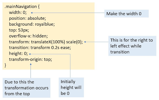
Removing spaces from the arrows & removing border from the last li Initially, the mobile navigation should be hidden, it should be visible only on clicking the hamburger icon. For that we are going to do the same as we did for the inner navigations, we will adding and removing open class to the main navigation division on clicking hamburger menu. For that the main navigation division's CSS needs to be modified as below:
CSS to hide the main navigation 
CSS to show navigation on clicking the hamburger menu Now, the jquery to be written on the hamburger icon click is:

jQuery for hamburger icon click To change the hamburger icon on click write the below CSS code:

CSS for changing hamburger icon to cross on click
We have created responsive navigation. There is one more thing to do. This is an activity for you. Try adding inner level navigations to the last menu i.e Menu Item 7. The inner navigation should be aligned towards the right as shown below:
 |
| Last Navigation Alignment |
The color code I have used for the body is rgb(217,171,251). For any queries or feedback, you can reach me at [email protected].

