CSS Animation
CSS animation allows us to make CSS properties of an element to be transitioned within some intervals.
Example: Most of the websites have a button at the bottom corner that takes the visitors to the top of the page on clicking it. Sometimes, that button may go unnoticed just like it is at www.rolls-royce.com. We can make it noticeable by adding some animation through CSS as shown below:
 |
| Example of CSS Animation |
CSS Animation or Animations through Javascript?
It is better to use CSS for animation when there is no user interaction needed to start the animation because if the animation needs to occur on clicking any element, that needs to be handled by javascript events. Thus, whenever we have to implement animations to happen without any user interaction, CSS animation properties can be used.
CSS Animation Properties
CSS animation for an element is defined by the CSS property, animation. Syntax of CSS animation property is shown in the below image:
 |
| Syntax of CSS Animation property |
Those written inside [] are the animation properties that can be specified individually and it is not mandatory to specify all the properties except animation-name and animation-duration.
We will go through each of these properties while developing the top of page button example. So, let's start with the example.
Example – Top of Page Button
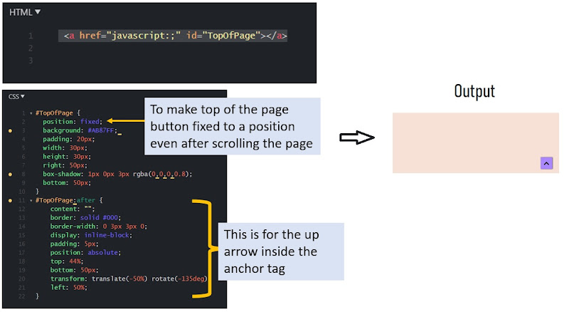
The HTML and CSS code for the top of the page button without animation would be as shown in the below image:
 |
| HTML, CSS Code for making the arrow button |
If you have not referred to the previous lessons, it might be difficult for you to make the up arrow. So, here is the URL for your reference: Go to the section "Pseudo Selector After/Before". To know more about position fixed, visit: 10 Important CSS properties: Position.
Steps to add CSS animation
Step 1: Determine which properties will be changed to get the desired output
Here, our intent is to animate the button up and down. We can achieve that by changing the bottom position of the anchor tag from 50px to 100px. Also, we are changing the background color of the anchor tag from #AB87FF to #B4E1FF. Thus, all we have to do is to change the bottom property from 50px to 100px and the background color from #AB87FF to #B4E1FF when the button moves up.
Step 2: Define your own animation using @keyframe rule
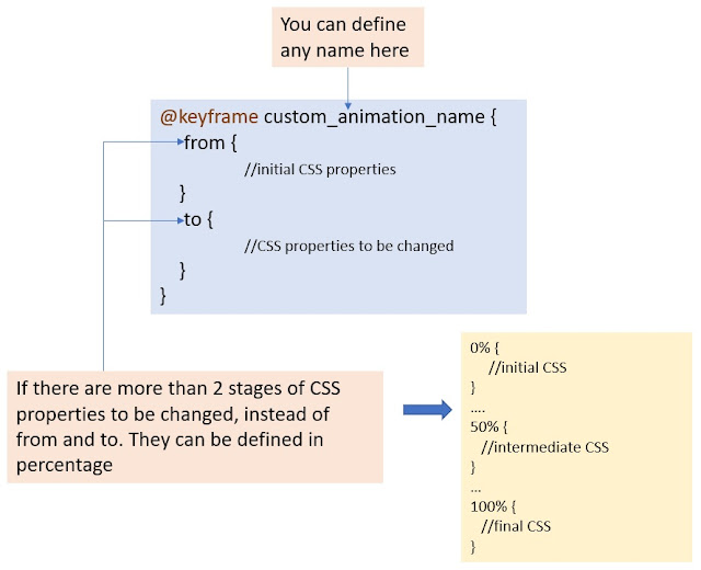
@Keyframe is a CSS rule that allows us to define our own animation. Below is the general syntax to write the keyframe rule:
 |
| Syntax of CSS Keyframe Rule |
Can you try writing the keyframe rule for our example? Well, it would be as shown below:
 |
| Keyframe rule for the top of page button |
You can visit jsFiddle to see the full code of this example.
Step 3: Add the created animation using CSS animation property to the element's CSS
We have already seen the syntax of the CSS animation property. For this example, I have defined the animation property as shown below:
| CSS animation for the top of page button |
Here,
- bounce is the animation-name that we have defined in the keyframe rule.
- 1.5s is the animation-duration which specifies how slower/faster the animation would be.
- ease is one of the predefined animation-timing-function that defines how smoothly the animation transition would happen.
- infinite is the animation-iteration-count i.e the number of times this animation will be repeated. As we need out button to have this animation to repeat forever, the animation-iteration-count will be infinite in our case.
- alternate is the value for animation-direction property so that the animation would happen to and fro.
Step 4: Add CSS property if you want to pause the animation on mouse hover/focus events
In this example, we want to pause the animation while the user takes their mouse over the button. This is done by the animation-play-state property as shown below:
 |
| CSS to pause the animation on hover |
Step 5: Make your code cross-browser compatible
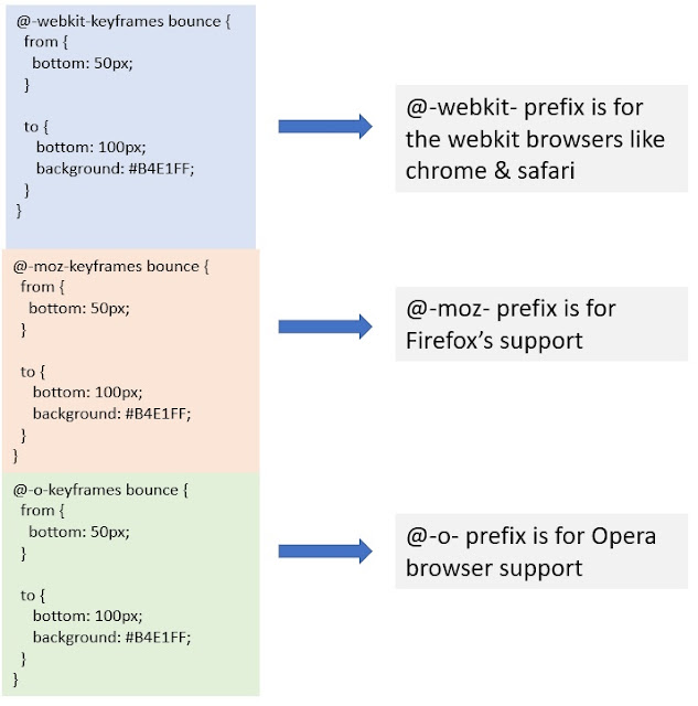
To make the animation properties working on different browsers, we need to copy the keyword rule as well as the animation properties with some prefixes as shown below:
 |
| CSS prefixes for cross-browser support |
So, the keyframe rule with these prefixes needs to be added to the CSS. Along with this, we have to add -webkit-,-moz- and -o- prefixes to the properties animation and transform. Please refer to the jsfiddle example.
If you want to go through each of the animation properties deeply, visit www.w3schools.com. For any queries, please reach out [email protected]. To get notified for the releases, subscribe through email.
If you found this helpful, please share it. Thank you 😊
